D&K Agri-Sales is a family-owned business in Plymouth, Nebraska, that sells and constructs all kinds of grain-handling equipment. That includes grain bins, dryers, augers, custom fabrication, and much more. They even design site layouts in 3D modeling software.
The owners had previously worked with another web design company to build a website, but the website never got finished. When they contacted me, I promised to build them a complete website and do it right. They were also interested in a logo for their business.
Logos
D&K did not have a real logo to speak of, but they had lots of places where they could have shown one. That was an opportunity they recognized and they realized they needed a logo to make their business brand stand out.
While I researched their business and customer base for their website, I also was doing research for their logo. I knew it needed to be something simple, bold, and clean. The logo would be used in a variety of environments. Out in the country, things get dirty – so it needed to show up well and be recognizable from a distance.
To start designing the logo, I began by just sketching ideas. As you can tell, I’m not a great artist, but pencil and paper is the best way I’ve found to generate lots of ideas quickly. There were some ideas I could eliminate quickly, and some that I would need to flesh out further.
After sketching out countless ideas, I narrowed them down to five to explore further. I created five high-fidelity logos with two or three variations, based on each of those ideas. I sent those to the folks at D&K to review and they selected the one they liked best.After some additional tweaking and adjustments to the logo, we had the final product:
I also designed some variations for the logo, some that might be more appropriate at smaller sizes or in different environments:
I think the final logo achieves the goals of being clean and simple, and also easily recognizable. It’s a bit rustic looking, but with a modern feel to it. The logo is set in Matchbook Regular.
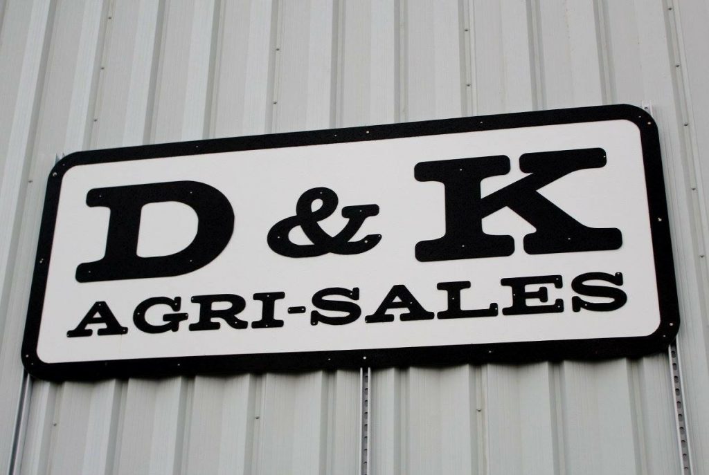
Since creating the logo, D&K Agri-Sales has used it in a lot of different places: website, building sign, business cards, flyers, shirts, truck decals, and even on TV commercials.
Here are some pictures of the logo in different environments:


After designing this original logo for them, a new commercial side of the business opened up. The Commercial side needed a separate, but cohesive brand.
The logo is set in Matchbook Regular and DIN Condensed
Website
It was important that the website provide enough information for visitors to get an overview of the types of products and services offered by D&K. We also wanted to showcase a variety of projects and provide an easy to way contact the business. D&K also sells equipment and new and used parts, so we needed a way for customers to view what was available.


Every website should display optimally on any device, so I made sure that D&K’s website functioned well on a variety of screens.

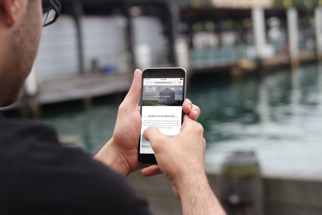
When designing this website, along with the logo, it was important that it be simple and modern, but also appeal to the stereotypical farmer. We were able to use a lot of photography to show all the work D&K has done, and integrate it right into the design. Their website is modern, easy to use, informative, and is helping D&K make a big presence online.
Following the initial launch of the website, I helped D&K set up an online e-commerce store to sell various parts and equipment – providing tens of thousands of dollars of additional sales to their business.