While I worked on our Point-of-Sale (POS) systems as a Business Analyst, a long-talked about project called “Offline Mode” finally grew legs and started moving forward.
Our POS application used a cloud-based back-end to connect with store’s back-office systems and enable payment authorizations. For most of our college campus customers, requiring network connectivity was not an issue. However, we did have a few customers in remote brick-and-mortar locations that could not get a reliable internet connection. In addition, some customers had a desire to be able to move a POS register outside of the store for temporary events, such as game days.
The obvious solution was for those customers to use a cellular hotspot, but at the time (and maybe even now), several of those customers could not get solid cellular service in their area. After much internal discussion, we decided that our POS systems should not be totally dependent on a network connection to function. If a store’s internet went down or they wanted to use a register in an area without connectivity, the POS should still offer minimal functions to complete transactions. I’m a big proponent of measuring network performance (with little or no connectivity) as a crucial metric of your application’s overall experience.
So, we created a small team to research and build a prototype “offline POS.”
Project Team
There were 3 of us on the core project team. A lead developer, a UI designer, and a Business Analyst (myself). From time to time, we would consult with other developers or team members for guidance.
My primary responsibilities were research, writing requirements, process mapping, design, and managing the project.
Challenges and Opportunities
As we began our research into how we might create a POS that worked offline, we realized that it would be nearly impossible to create an “offline mode” with our existing cloud-based application. There were also some “code quality” discussions, as the original version had been built by a third party. We recognized this as an opportunity. If we needed to rewrite the application to support offline capability, it was also an opportunity to refactor the existing code and build a foundation for the next generation of the POS application.
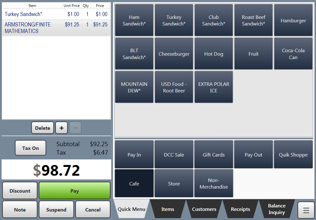
The original UI was also pretty bad. Since we were looking at doing a rewrite, it made sense redesign and modernize that experience.
Since our original project scope was just to prototype an offline mode, we came up with a plan. We would rewrite the POS app with only basic functions and a new UI, and it would work offline by default. It could also work alongside our existing POS system, so customers that wanted offline support could begin using it sooner. Once the basic POS system and UI was designed and built, we could slowly rewrite the additional functions, and eventually build a full replacement for the system.
Offline Mode Research
We began discussions about how to build an offline mode. The main challenge to solve was how to get items to be sold into the offline POS system, and then after running transactions – syncing those to the back-office for record-keeping, balancing accounts, and reporting.
We started designing this process for the simplest scenario possible. The offline POS register would be used for a planned offline event, and it would be limited to only accepting cash or check tenders.

This process design did not account for unplanned network outages, but our primary goal was to ensure data integrity by keeping it simple and straightforward in this initial version.

The design worked, and it allowed us to create prototype POS application that could solve part of the customer problem.
UI Redesign Research
While our lead developer focused on building the offline POS prototype, I split my time between working with him and working with our designer to research and redesign the UI.
We of course knew in our gut that the current POS UI wasn’t great, but we needed to do research to identify specific usability and workflow issues.
We started our research by firing up the ol’ Google machine and researching the competition. Specifically, we wanted to gather inspiration and ideas that could be directly adapted to our system. We also visited some specific sites around town that were using some of the hot new POS systems, to get a customer experience view directly.
I created a customer journey map to help guide the redesign of our workflows, and ensure that future functionality could be easily added.

Usability Testing
We had never put our POS system through a usability test before, and the time of our annual users’ meeting was approaching. This seemed to be the perfect time to create a usability test of our current POS system.
We recruited users ahead of time and set up a POS register and camera (for recording the sessions) in a separate area. We also created a set of exercises for each tester to complete. Most of our recruits were not familiar with our POS system – many of them were on an older version. We did not provide them any instructions to complete the exercises.
The results of the usability test were extremely valuable, and provided clear objectives that the UI redesign needed to solve. Here are some of the things we found:
- Text on the screen was hard to read – either it was too small or did not have enough contrast against the background
- Some UI controls were too small to tap reliably using the touch screen
- Users were confused about the purpose and state of some buttons:
- Button text was unclear about the action it performed
- Placement of the button on the screen was confusing
- Icon on the button was confusing
- Color or the state of the button was confusing
- Many users were uncertain if they had successfully completed a task, or what they needed to do next
Despite all the usability problems we identified, our participants mostly enjoyed the exercise and were happy to help.
Redesign Goals and Work
Armed with a vast amount of research, we started creating mockups for a new POS system UI. Our overall goals for the redesign were:
- Modernize the look and feel
- Improve readability and clarity of functions
- Put the focus on what is important at the time
- Make use of wasted space
- Try not to change the UI too much, so it isn’t a challenge for our users to re-learn
Here are some comparison samples between the old POS screens and the redesigned UI mockups created by our designer.


Challenges and Results
As is the case with many UI projects, it can be a challenge for developers to implement a “pixel perfect” UI. This is partly due to developer skill and experience with front-end design concepts. Unless your developer is skilled in this area, my recommendation is working with them in an iterative approach, keep things simple, provide time for revision, and don’t expect pixel-perfect precision. This was definitely the case on this project – the initial prototype POS application strayed a ways from the design mockups. However as a starting point, it was a big improvement over the original UI, and had the spirit of the redesign at heart.

Before I had a chance to fully launch this newly redesigned POS with offline capability, some company reorganization happened. I was given the opportunity to focus full time on UX/UI, and was assigned to other projects.
Since then, the team has continued to improve the offline POS application’s capabilities and improved its UI even more.


