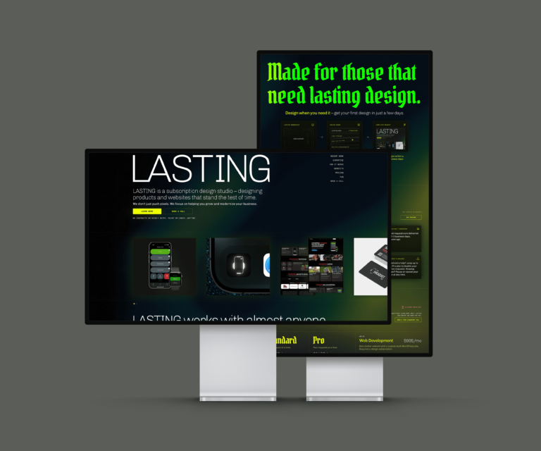
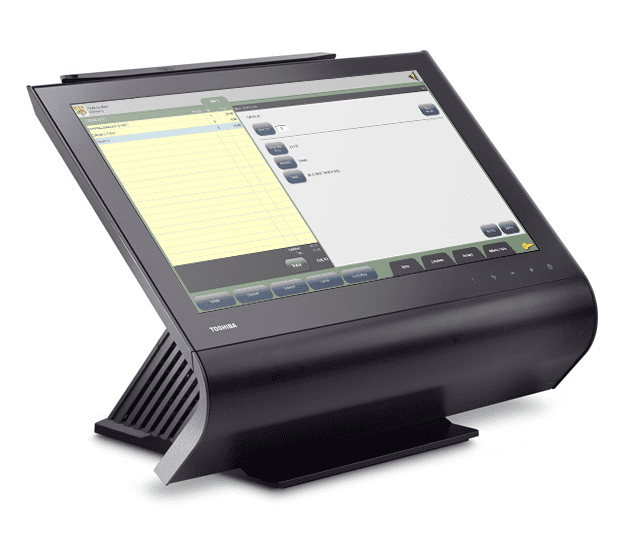
I worked as a Business Analyst for our Point of Sale (POS) products for about a year and a half. We had both traditional “cash registers” you would see at a typical retail location, as well as a mobile (iPhone) POS product.

This write-up is actually about two separate projects. The first project was development of the Quick Menu feature, and following that was an upgrade the Quick Menu – allowing for Made-to-Order type transactions. Because of their close correlation, I am writing about them together.
As a Business Analyst, I did research, wrote requirements, provided design direction, collaborated with developers on design and implementation, and provided user-acceptance testing. On these projects, I worked closely with a UI designer, developers, sales representatives, and directly with end-users.
Our Users
Typical users of our POS products were employees of campus bookstores – mostly selling apparel and textbooks to students. On-campus bookstores are often part of a larger “auxiliary services” department, which also run things like cafeterias, convenience stores, mail centers, and parking services.
Our POS systems could already support the types of items and services sold at these locations. However, many of these items were not barcoded, so the POS registers did not have an easy or efficient user interface for a cashier to sell them with. Therefore, we launched a project to design and build a front-end “quick menu” for the registers, and a back-end UI to configure the menu.
Quick Menu Research & Design
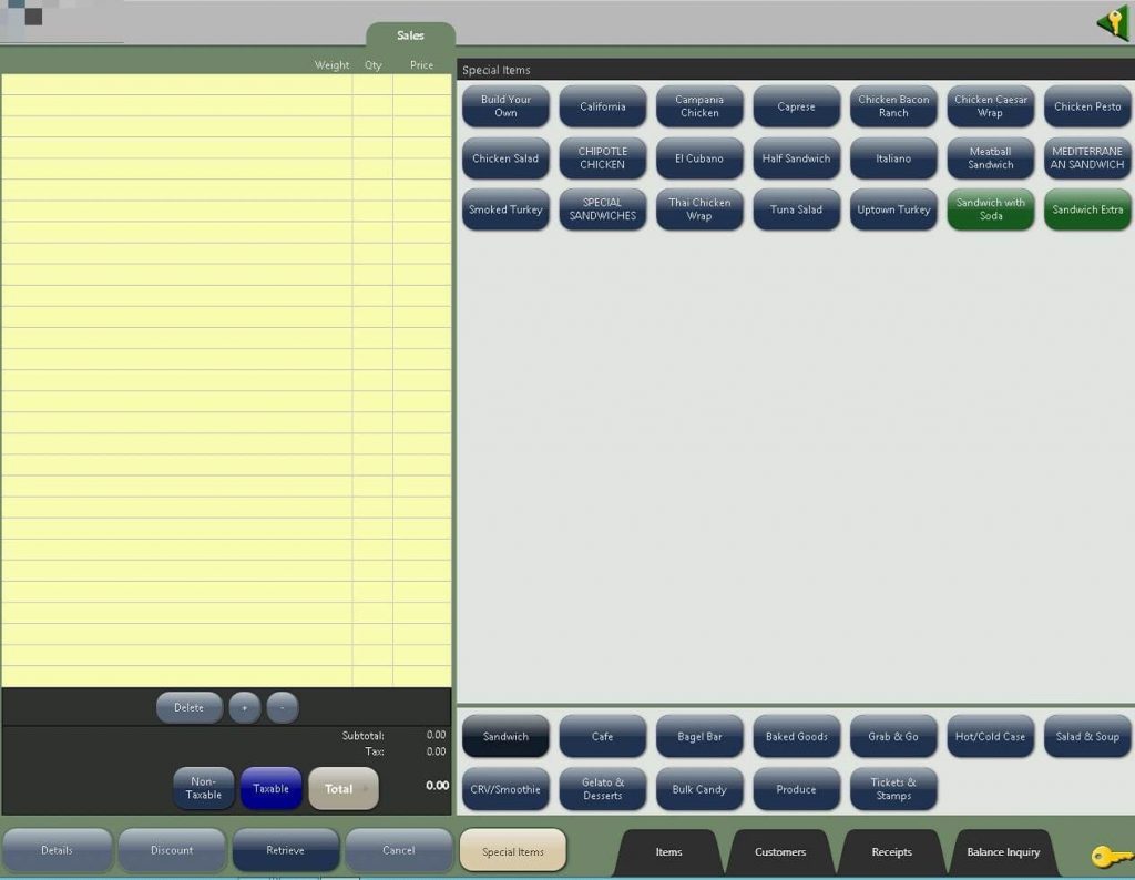
The first version of the Quick Menu had a fairly simple scope. It allowed users to take items created in their back-office system, and selectively import them into a custom menu of buttons that would appear on the register screen.

Quick Menu Results
The Quick Menu was rapidly adopted by customers, especially since it only took a few minutes to begin selling items that were already in their system. It also created the rudimentary possibilities of using our POS systems outside of the campus bookstore.
Some directors of Auxiliary Service departments began to approach us about using our POS in other locations under their management. This feature allowed our POS to start being used in convenience stores, parking areas, and mail centers. It also drove strong demand for even more functionality.
The Demand for Made-to-Order
The success of the original version of the Quick Menu led Auxiliary Service Directors to become interested in using our POS system in campus restaurants, cafeterias, and food trucks. These types of locations needed to sell made-to-order style items – where customers can choose from a range of selectable options for an item.
A familiar scenario for this is a sandwich shop, where you can choose the type of bread, meat, cheese, and toppings for your sandwich. Some of these options might be premium, with an additional cost for the customer.
Made-to-Order Research
To better understand the need for Made-to-Order functionality, myself, a developer on the POS product, and a sales representative visited the campus of a leading southern California university. We visited the various sites they were currently using our POS, as well as the sites where they were hoping to begin using it. We interviewed multiple front-line workers and supervisors to learn about their current systems and processes.
This research was immensely valuable, and directly influenced the direction and outcome of this project.
Made-to-Order Design Challenges
When designing brand new feature or product, you can often suffer from “blank slate” syndrome. We knew what our users wanted, but designing the how is often difficult because there is almost always more than one direction for a solution to follow. You also don’t want to over-design the solution with unnecessary functions. Design is often about making choices about what is important for your product, and purposely saying ‘no’ to options that distract from that.
Eventually we worked through several high-level workflow ideas to settle on a basic flow. Our POS system design was out-sourced and not exactly an ideal starting point for designing a major new UI feature. A full UI redesign would come later, so we had to figure out how to design it within the current framework, and in a manner that our developers could achieve.
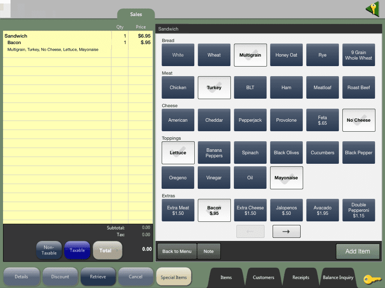

Once we had a rough idea for the made-to-order POS UI, we needed to also design a new UI and workflow for our users to configure their made-to-order menus, since it was completely customizable.
Our UI designer on the project had a brilliant idea to design the empty/default state of the UI as a static skeleton screen, with placeholder elements creating a visual likeness with the final front-end UI. This worked well, because the menu could be configured with any items. By seeing a close representation of how it would look for the folks running the actual registers, the users creating these screens would already know what the final result would look like.

Value Delivered
The Made-to-Order Menu feature was very well received by our users, especially those with large footprints on their campus. It was not something that every customer would use, but it allowed us to enter new areas of campuses with our POS products, that were not accessible before.