Introduction
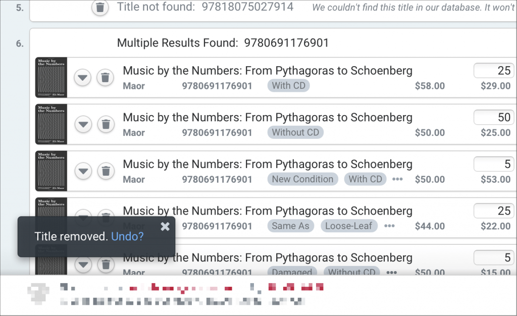
This project was a redesign of legacy website that was over 15 years old. The website was used by textbook buyers at college bookstores to order textbooks from our company.
The goal of the project was to modernize the platform, and improve the user flows, information architecture, and aesthetics.
Our team consisted of a Product Owner, Business Stakeholders, UX/UI Designer (me), Developers, and a user research agency.
Legacy Website
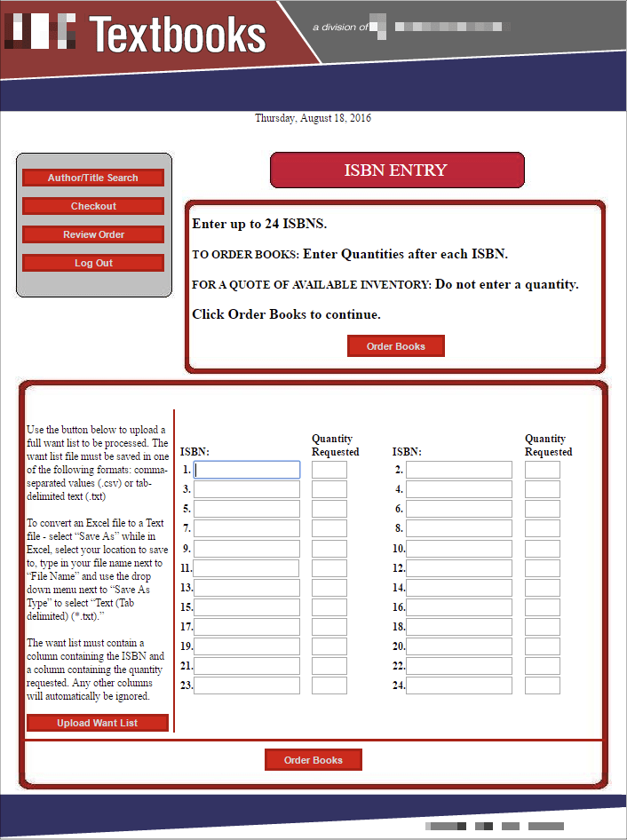
Some screens from the old website. Can you tell what is a button? 🙃


Design Sprint and Research
As a company, we were inexperienced with doing user research, so we partnered with an outside agency. They facilitated a week-long design sprint with the project team, built a prototype, and conducted an initial round of user interviews.
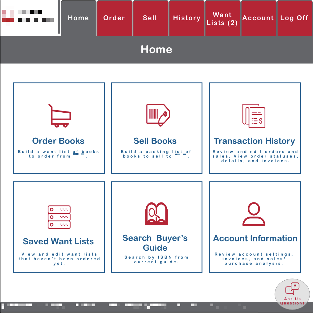

Following the research gathering, the prototype was revised, and handed off to me to design the finished UI.
UI Design
While I had the pleasure of being involved with the project through the design sprint and research phase, my primary responsibility was to take the rough prototype, and create mockups of the final UI to provide to our development team.


Challenges and Constraints
The biggest challenge for me and most of the team, was understanding how users purchase our products. It’s different than normal e-commerce.
While the legacy platform was extremely dated, our users were also very used to it. We tried to keep this in mind when designing the new site, so user flows and information architecture weren’t too different from the legacy site.
I also had a very short timeline to design the final UI mockups for the development team, after the prototype and research was provided by the outside agency. We had a launch date to hit.
Delivering Value
The new website has greatly increased customer satisfaction, ordering conversions, reduced customer service calls, and manual entry work.
“I love the new site. I’ve been ordering from Nebraska Book Company for almost 20 years and this new site is amazing!”
A happy customer


Additional Work After Launch
Following the launch of the site, I continued working on this product over the next few years.
I collaborated with the product stakeholders to document and prioritize a lengthy backlog of product ideas. Once the top priorities were identified and level of effort was determined, I managed a project to complete these items – including requirements, design, and testing. The main items in this project were to enhance the order process based on customer feedback, increase loading speed on certain screens, and, make lots of little UI refinements.
I did discovery and design work of a “Sell” feature for the site. Once again, gathering and writing requirements, creating a user flow, and designing high-fidelity mockups for the entire process. Unfortunately, this feature did not make it to the development phase due to competing priorities.

I also conducted more user interviews and had user testing of new prototyped features. Since the original UI was somewhat rushed, I did design ideation work of improvements in both aesthetics and efficiency of the UI. This also helped to create a vision for future product ideas.


