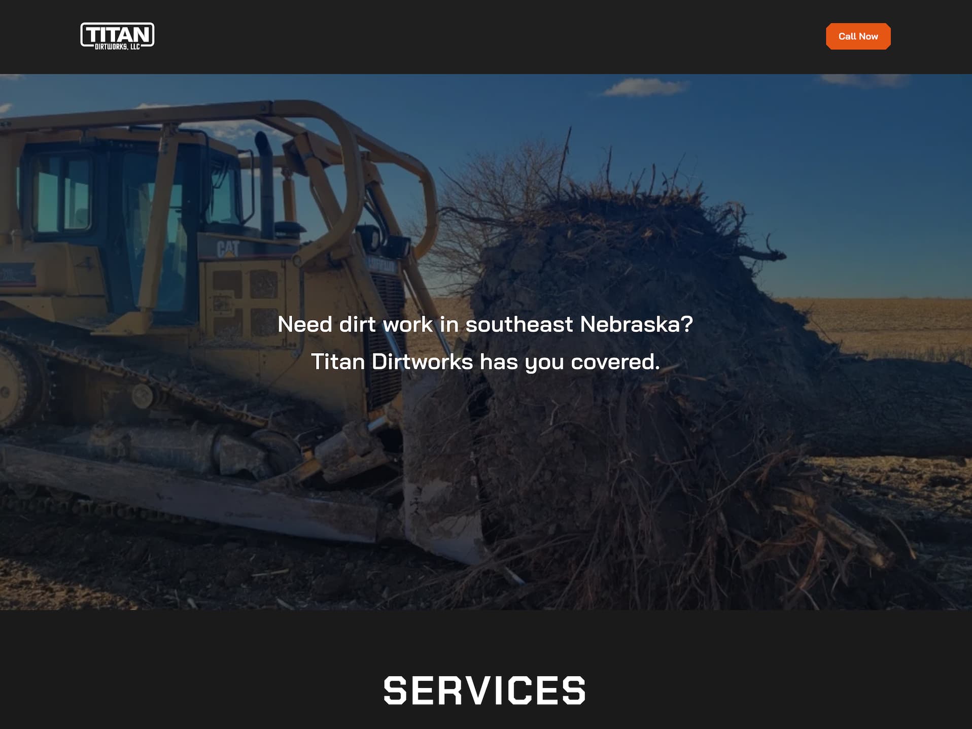
This is a recent website that I designed and developed for a local dirt work business. The project was quick and simple, so the site came together pretty quickly.
I was provided a few pictures, a logo, and a little information – so I made a lot of educated design decisions on how the site should look.
A few notable touches are the icons and typography. Headings are set in Chakra Petch, while body text is set in Bai Jamjuree. This pairing compliments each other nicely, while still being quite readable and modern.
To further compliment the angular geometry of the headings, I notched the corners of buttons, cards, and a few other elements.
For a live view, check out the website.


