The Headset App is a startup that is aiming to completely revolutionize the sports communication market. They contacted me because they needed some design help across all aspects: their app, their website, and branded materials. Our work together is ongoing, and updates may be added here as time goes on.
As an early-stage startup, The Headset App team is small. They do not have a full-time designer or a dedicated front-end developer on staff. Their team put together a website to build their initial web presence, but they recognized that it needed a lot of improvement.
There were some big changes needed to the site:
- Design refresh
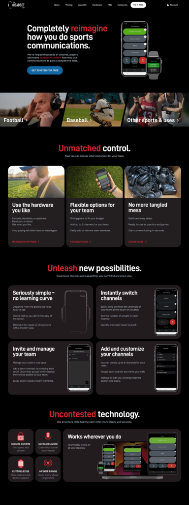
- Content design around new use cases of Baseball and other sports (the app was originally designed for Football)
- Clearer communication of benefits and differentiators between the app and the current industry standard
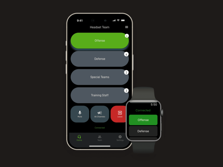
- Showcase the innovative technology, simplicity, and features of the app
- Additional social proof
- Clearer calls to action and information architecture
- Improved mobile layout

The team already had a staging site set up with some of these new ideas roughly added in.

There were some good ideas here in this staging site, but it needed a lot of design love.
Design
I carefully reviewed what they had, making notes along the way of what to change. I then built a high-fidelity mockup in Figma of a new design.
The team loved this refreshed design direction. A lot of time was spent on design fundamentals, like typography, spacing, and structure. I think the new design is a lot simpler, clearer, and cohesive.
Development
The biggest effort was still to come – actually building out the new design. After lots of hours of work, I had the complete new site design built and ready to go. While most of the focus was on the homepage and new “use-case” pages, every page got some much-needed design love.
After the team’s approval, we deployed the new site to the live server. It’s been live for a few months now, and we’ve made some various minor updates to it already.
Gallery of some current live site pages


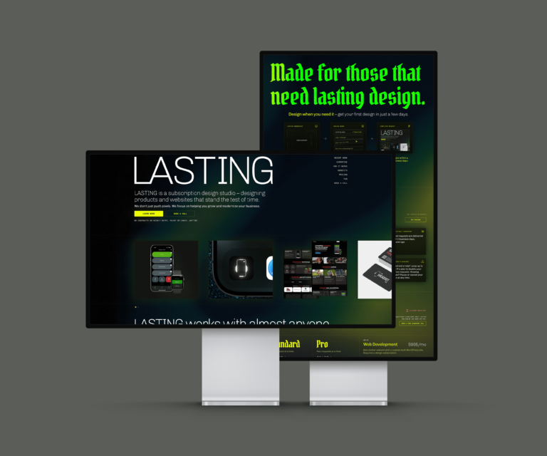
Overall, this new site design has worked well, and we’ve begun to expand some elements of this design language into branded materials and other areas.
I think we successfully met all the goals we set out to accomplish with this redesign. We’re certainly not done – there are plenty of further improvements myself and the team are working on.
This redesign gives The Headset App team much more credibility and ability to compete in a well-established industry.
Growth
App usage and awareness has increased nicely while we’ve been working together.
New team segments:
- Flag football league
- Arena football league
- Prospect League Partnership (baseball)
- Hospitality communication


