The Headset App is a startup that is aiming to completely revolutionize the sports communication market. They contacted me because they needed some design help across all aspects: their app, their website, and branded materials. Our work together is ongoing, and updates may be added here as time goes on.
As an early-stage startup, The Headset App team is small. They do not have a full-time designer or a dedicated front-end developer on staff. Their team put together the first version of the app as a proof-of-concept, but they recognized that it needed some significant design improvements.
These were our goals for the initial design changes to the app:
- Improve the design of the home (channels) screen, as this is the core part of the app.
- Review entire app workflow and identify UX problems and areas to improve.
- Design mockups and prototypes for upcoming new features.
Home screen design
The initial version of the app built by the developers on the team looked like this:
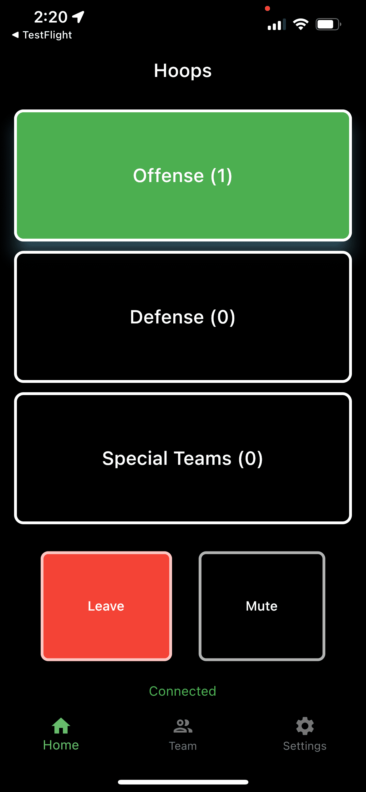
Certainly not the nicest thing to look at, but props to the team for making it intuitive to begin with.
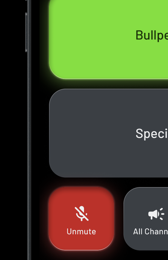
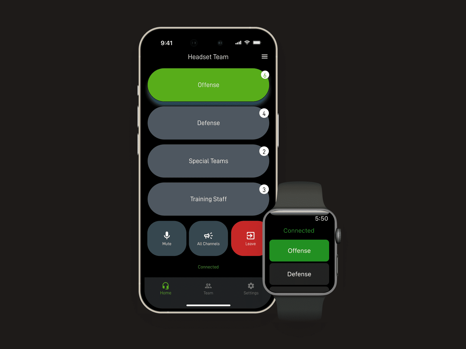
After iterating with the team, we landed on the design you see at the top of the page. Here are some additional visuals.
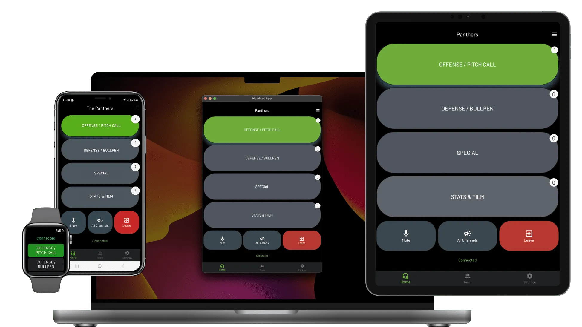
There’s still much room for improvement, and we continue to work on all design aspects of the app.
User journey
The home (channels) screen of the app is pretty simple, but there are a number of things for a new customer of the app to do when setting it up: creating an account, inviting team members, customizing channels, and licensing the app.
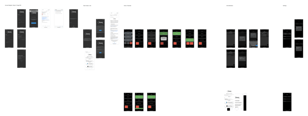
So far, we’ve worked on improving the Settings screen and email design. A big area of focus now is the onboarding process.
New features and improvements
The team has added several new features and improvements, with many in the works. Some of those new features include:
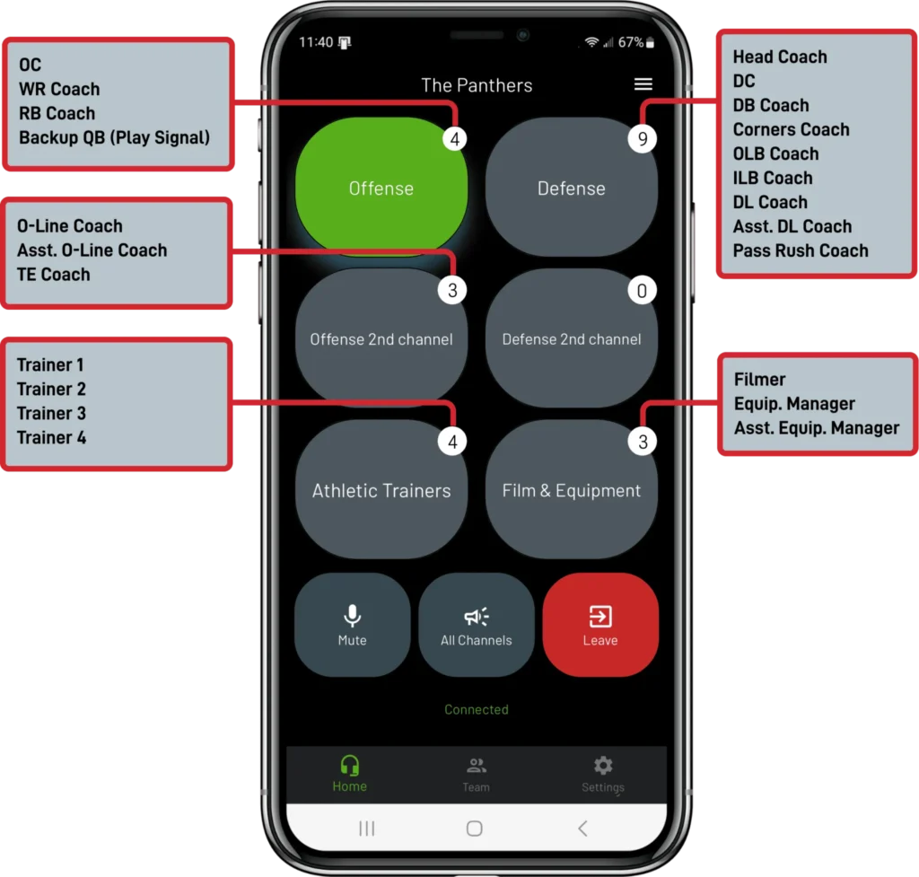
- Support up to 6 channels on home screen
- Set team members as inactive or “listen-only”
- Connected users drawer
- Apple Watch companion app
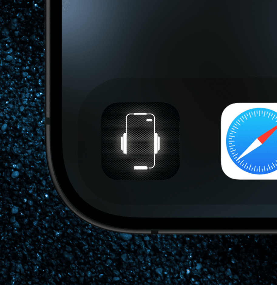
- New app icon
Growth
App usage and awareness has increased nicely while we’ve been working together.
New team segments:
- Flag football league
- Arena football league
- Prospect League Partnership (baseball)
- Hospitality communication
In the works
I’m continuing to work with The Headset App team to improve their app, making it more powerful and easier to use. A few things we’re working on:
- Pitch calling feature
- Significant UI refinements
- UI consistency and standardization
- Improved hardware interactions
- New interaction use-cases for other types of teams
- Improved onboarding
I can’t show much of these work-in-progress items, but here’s a small taste:
