Introduction
The majority of Nebraska Book Company’s core business processes ran on a Mainframe system, that was nearly 40 years old. This system required dedicated developers and operators, just to keep it running smoothly. We also had personnel in the company doing highly manual tasks on the Mainframe, just because those tasks had not been integrated or automated in a newer system.
Not surprising, the Mainframe system was incredibly hard to learn and understand. The only users skilled with using it had been there for many years, so the business became highly dependent on them.
Another less obvious, but just as problematic issue with this system was its poor data structure and reporting capability.
With the closure of the company’s 3PL venture, we realized that we needed a system that could provide transparency and actionable tools to manage data and APIs.
My role
I served as a product owner, researcher, and solo designer on this project. I also helped shape the strategy of how we could best tackle this monumental, multi-year project.
The Vision and Goal
The original vision of this project was born out of fixing the failures of the 3PL business. We envisioned a system where data was well-structured, validation was robust, failures were surfaced and reported, and a system that was easy to use for a new employee.
We were in the early stages of building out the first pieces of this new 3PL management platform when the business leadership recognized that we needed to refocus on our core business, and we wouldn’t be able to grow that with the overhead of our Mainframe. It wasn’t too much of a stretch to adjust our 3PL vision for the core business instead, as many of the key processes were similar.
Our new strategic vision was to build a system to eventually replace nearly every internal system at NBC. Of course, the big kahuna was that Mainframe, but there were probably a dozen smaller systems that would also be re-architected into this One System to Rule Them All.
We set an ambitious goal – to kill the Mainframe in about a year and a half.
Initial Planning
We had already done some research and design on the 3PL outbound processes, but we shifted gears to focus on two areas:
- Receiving inbound shipments
- Providing visibility into outbound orders and products

We reorganized our development team into two: Inbound and Outbound. I was the Product Owner for the Inbound team, and designer for both teams.
Our Users and Release Strategy
We were building this with the intention to have everyone in the company using it as their main system for day-to-day work. This would include a wide range of people, from the leadership team, data science, customer service, and warehouse workers.
Because our user base was going to be of all different levels, we knew what we were building needed to be really easy to use and intuitive. Since this would be a multiphase rollout, we would also be asking folks to have to learn yet another system. We knew this would be especially challenging with our initial releases, because not all functionality would be in place for users to do their job on entirely on the new system.
We also knew it was important to release on a regular cadence, and have our first release provide a decent value proposition to get some users excited about it.
Another consideration was that several of our users were Mainframe gurus who had become masters at using it over the 20 or 30 years they had worked at the company. They were extremely good at their job – even if it didn’t make sense in a modern system. CLIs like our Mainframe can be very efficient, requiring only minimal keystrokes to master. Watching these veteran users do their job could make your head spin at times. We knew designing a new system for these users was going to be especially challenging.
Research, Architecture, and Design
We began researching our current inbound shipment processes, starting our focus at the receiving end of the dock. As we documented the current process, we also gathered input from our users and stakeholders on issues with the current process, and their wants and needs going forward.
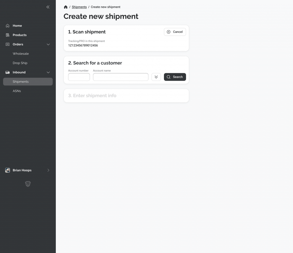
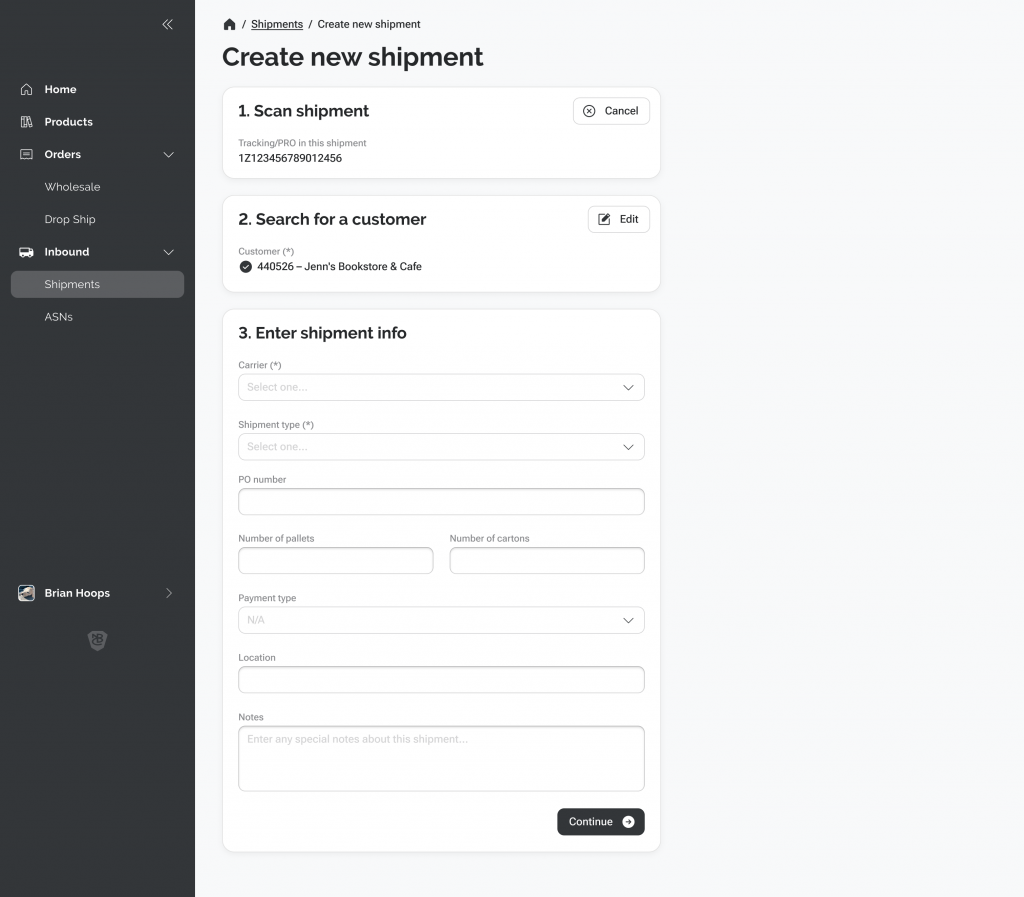
We started designing new user flows, and our lead developers began drawing out their vision for a new microservice architecture. This would help us transition from our legacy systems to a new one in a much cleaner way – and be less disruptive to our end-users.

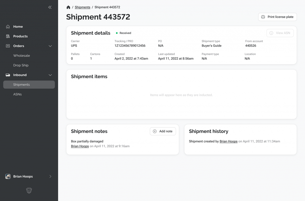
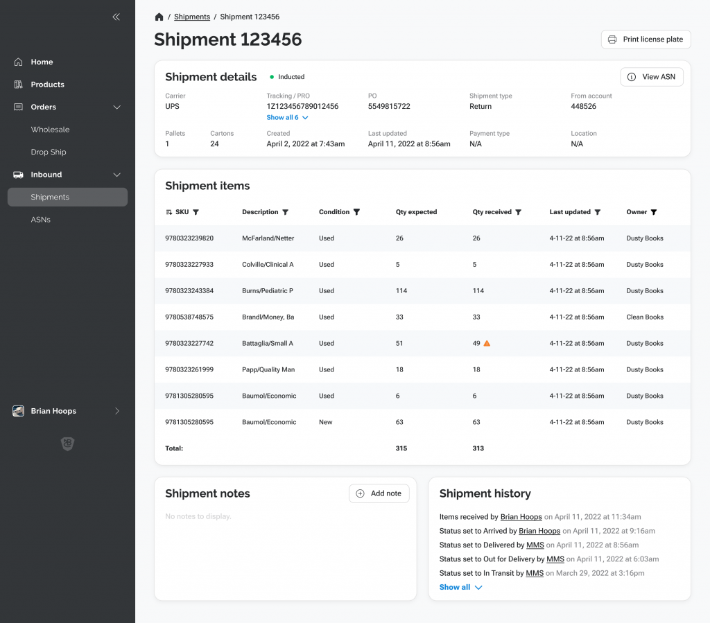
As the solo designer on this project, I had to look at this project as one big system, and I began designing screens and workflows in earnest. My initial goals for the design were fairly modest:
- Modern, responsive design in an easy to navigate web-app.
- Flexible views with the ability for users to filter, sort, and search for exactly what they are looking for.
- Transparency into the underlying data – if we had garbage data, I didn’t want to try to mask it in the UI.
- Provide relevant context whenever possible. With this new system, we had the ability to combine different sources of data to show a more realistic view across different systems.
- Make it as easy to understand and learn if you were a brand-new employee.
- Design the front-end in a realistic-to-implement way. We needed our developers to be able to build the vision, and not make it too fanciful or over-optimized.
- Incorporate elements from the company brand standards.
I’m a big believer in having an iterative design process. It’s good to get feedback on a design early and often, and make lots of variations of it. I also knew that we would need to return to these screens in later releases, incorporating user feedback and our own learnings.




Challenges and Learnings
This project had a number of challenges and lessons to be learned.
Initially, users were skeptical about our vision for this new system. They didn’t see what was in it for them.
Another challenge was just around using new technology – many of the services we were using were new and modern and “very cool,” but they were unfamiliar. So a lot of learning had to be done as we went along.
One of our key factors when planning out the build of this new system was the ability to connect old data into the new UI. This was a stopgap measure, but allowed us to get users using the system without having to also re-architect the data structure first.
Speaking of data structure – we quickly learned that we didn’t have any kind of consistency in past systems. For example, orders in another system had an entirely different structure than orders in our Mainframe.
We also had some challenges with front-end frameworks. Initially, we were looking at using Vue.JS as a front-end framework, although no one on the team was familiar with it. Eventually we decided to use Blazor, which was easier for the team to learn, but less mature and had its own challenges.
One thing that I had to learn was that I needed to resist the urge to do high-fidelity mockups when there are a lot of unknowns. Use high-fidelity designs for ideation as you explore and learn. Wireframes are your friend in this situation.
It’s also important not to worry about building a Design System from the beginning. You won’t know enough early on to make it a system. If it’s a big project that will need one, you’ll need to account for that later in the project.
Results
It’s extremely disappointing that we were literally days away from our first release of this new system, when Nebraska Book Company suddenly closed its doors. Everyone on our team was excited about the launch, and unfortunately we are only left with the work we did and the things we learned along the way.

